

About This Template
A site for boutique studios
Obsidian is built for the boutique creative agency, the freelance designer ready to scale, and the solo creative director running a tight ship. The visual register is editorial agency-portfolio: a warm cream paper background, deep forest-green CTAs and dark sections, and Playfair Display set in bold upright serif with one italic word per headline as the signature accent. It feels closer to a quarterly magazine than a tech startup.
Bold serif on warm paper
This fixture is a faithful port of the Omega Framer template — avatar group above the hero headline, a tight rectangular photo marquee under it, the six-service grid with dark forest-green icon squares, the inverted dark-green testimonial spotlight with portrait and client-logo strip, the three project cards with year overlay, the two-row testimonial card row with five forest-green Lucide stars per card, the three-tier pricing with the middle card inverted, the insights & updates blog grid with circular forest-green arrow buttons, and the cream-card FAQ accordion with forest-green +/- icons.
Six services, one shape
Every service card carries a dark forest-green icon square in the top-left and a Playfair title beneath — the signature Omega detail that says boutique-studio. The same shape repeats in pricing (forest-green plan name, cream surface, lifted middle plan) and in the works grid (image + bold serif title + year). One palette, one typeface pair, six service cards, three plans, three case studies — the discipline of a real studio's site.
Launch in 5 Steps
Replace Aether Studio with your agency name and tagline
Swap the six service cards to match your real offerings
Replace the three case studies with your own real work
Paste your real testimonial logos into the spotlight strip
Connect the contact form to your inbox or CRM
Obsidian
Light editorial agency portfolio with deep forest-green accents and bold Playfair Display headlines. Italic-accent typography (one word per headline italicized) on cream paper background. Six-service grid + dark testimonial spotlight + 3-tier pricing + FAQ accordion. For boutique creative agencies, freelance studios, and solo agency owners.
Free to use · No credit card required
Key Highlights
Built For
Related Templates
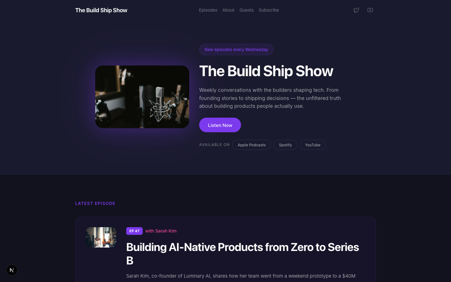
Airwave
A bold podcast and creator page with dark charcoal tones, electric purple accents, episode listings, guest spotlights, and platform subscription links — designed for shows that want to look as good as they sound.
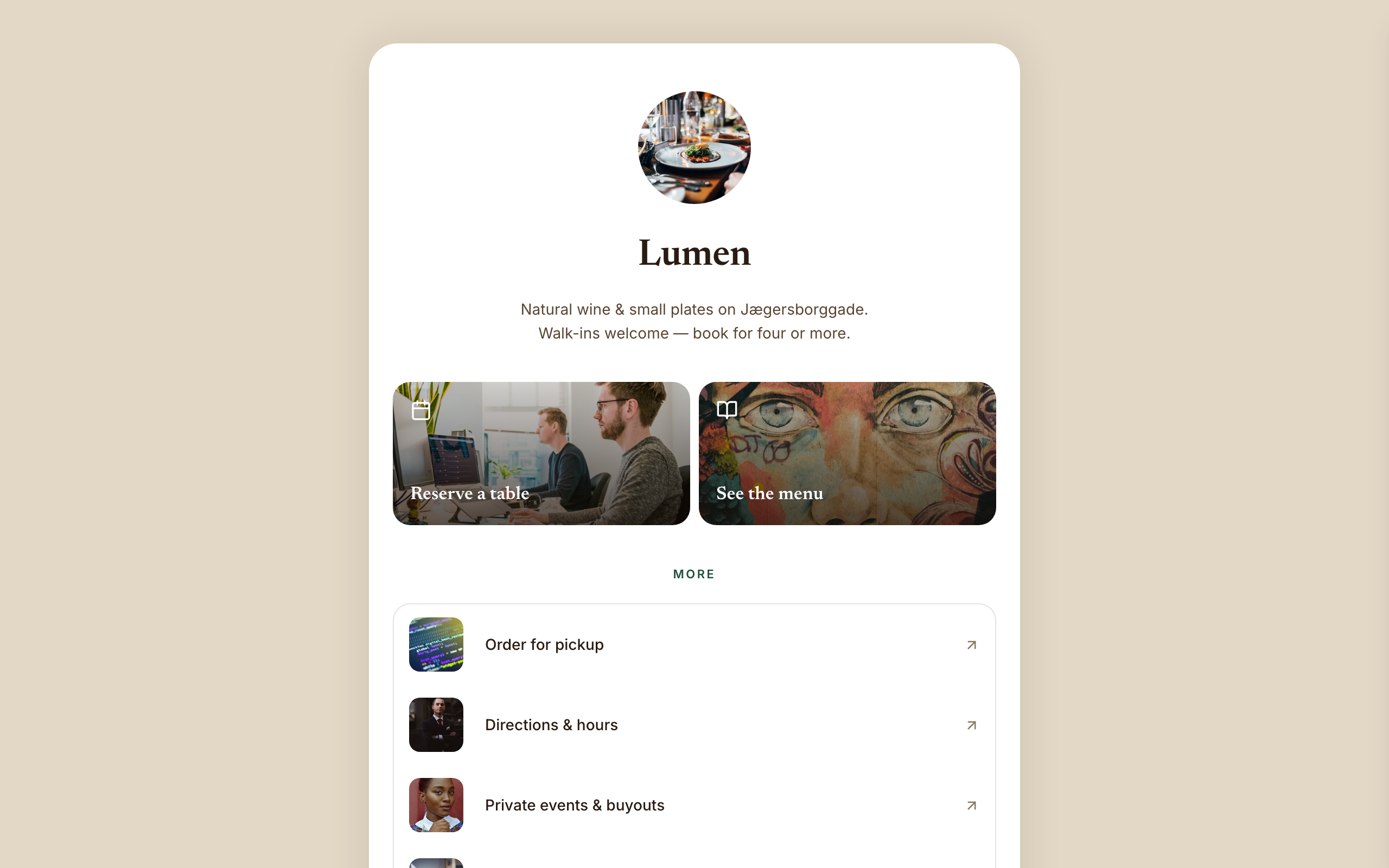
Amber
Warm hospitality link-in-bio for a café, wine bar, or restaurant — a faithful Linktree profile-card. A warm-sand page gutter with one elevated, fully-rounded ~600px centered white card; no header, no footer, and no email-capture section (a venue converts on reserve/menu/call). Ink-brown type, a bottle-green accent, Newsreader + Inter. Inside the card: circular logo → serif name → one-line bio → a 2-up photo-backed action pair (Reserve · Menu) → a grouped flat list panel with photo thumbnails → a social/contact row with a real tap-to-call link, then a horizontal 'on now' shelf of 3 Stripe items, and a short about block the card ends on. The action tiles ARE the conversion (menu-reservation).
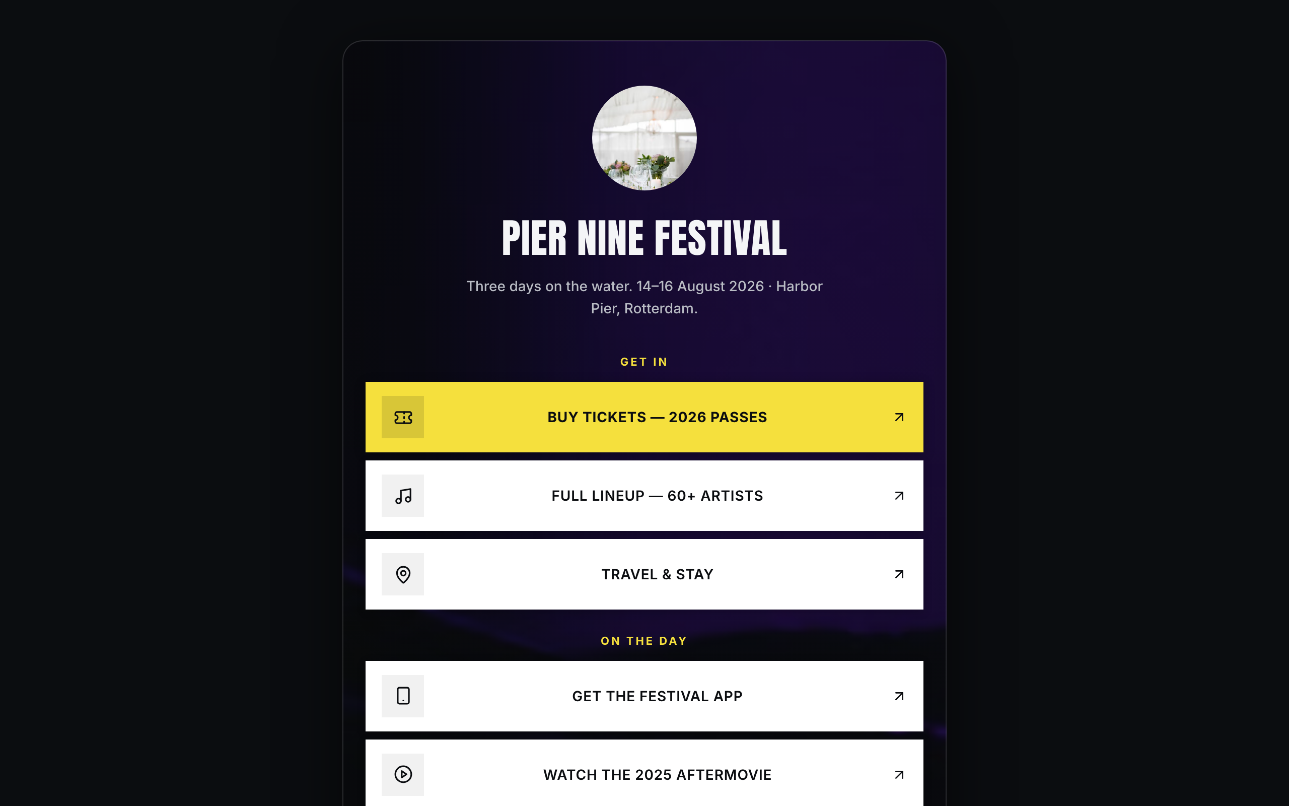
Arena
Brand/organization link-in-bio for festivals and live events — a faithful Linktree profile-card. A plain near-black page gutter with one elevated, fully-rounded ~600px centered card; the darkened event photo lives INSIDE the card. No header, no footer. Off-white type, festival-yellow accent, Anton + Inter. Inside the card over the photo: circular logo → bold condensed name → dates/location line → vertical stack of sharp white cards (square logo tile, 2-line label; the priority Buy-tickets card filled festival-yellow) → social-icon row, then a stacked passes strip with Stripe buy buttons, a short about block, and the inline presale-list capture the card ends on. The cards ARE the conversion (ticket-sale).